Showing posts with label matplotlib. Show all posts

Monday, 11 September 2017

Data Science & Machine Learning - 6.4 Matplotlib Plots Customization

Hi friends,

Welcome to this post on Matplotlib Plots Customization under Data Science & Machine Learning. In the previous post, we discussed how to draw subplots using Matplotlib. In this post, we will learn to customize (plot color, plot style, etc.) our plots.

Note: All the commands discussed below are run in the Jupyter Notebook environment. See this post on Jupyter Notebook to know about it in detail.
Matplotlib Plots Customization

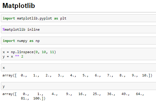
Let's first import the Matplotlib library and also recreate the NumPy Array we created in the previous post as the data for the plots. I suggest you to go through this post if you find any difficulties in any of the statements executed below:


Let's now create some plots with the Matplotlib:


Change the plot color

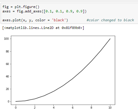
Matplotlib supports two ways (using the color name and the RGB hex code) of changing the color of the plot using the color parameter of the plot method. I have changed the plot color to black using these two ways in the below example:


Change the line opacity

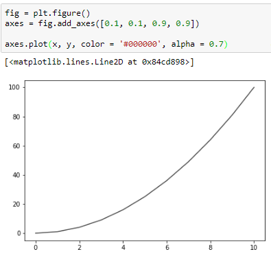
We can also change the opacity of the line of the plot using the alpha parameter of the plot method. The higher the alpha value the more opaque the plot. I have set the opacity to 0.8 in the below example:

Change the line width

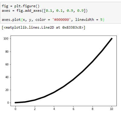
We can change the width of the line of the plot using the linewidth parameter of the plot method. I have changed the linewidth to five times the default line width in the below example:


Change the line style

Matplotlib also supports various line styles for the plots. These can be changed by the linestyle parameter of the plot method. Below is an example of the dashed line style supported by the plot method:


Here is a list of all the style types supported by the plot method:

['solid' | 'dashed' | 'dashdot' | 'dotted' | (offset, on-off-dash-seq) |  '-' | '--' | '-.' | ':' | 'None' | ' ' | '']


Marker for the actual points

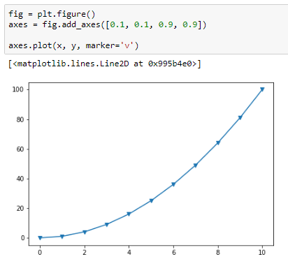
Matplotlib also supports marking actual points on the graph using the marker parameter of the plot() method. Here is an example of triangle down marker:


The following link lists all the marker types supported by the plot method. I also recommend visiting this awesome link which provides tons of other customization options we can do with Matplotlib. With this, we end this post on Matplotlib. From the next post onward, we'll learn about Seaborn, another very important Data Science library to plot beautiful statistical plots.
Share:

Saturday, 19 August 2017

Data Science & Machine Learning - 6.3 Matplotlib Subplots & Other Features

Hi friends,

Welcome to another post on Python's Matplotlib library under Data Science & Machine Learning. In the previous post, we discussed basic ways to draw plots using Matplotlib. In this post, we'll see how to draw subplots using the Matplotlib library. 

Note: All the commands discussed below are run in the Jupyter Notebook environment. See this post on Jupyter Notebook to know about it in detail.
Matplotlib subplots

Let's first import the Matplotlib library and also recreate the NumPy Array we created in the previous post as the data for the plots. I suggest you to go through the previous post if you find any difficulties in any of the statements executed below:


Let's now start with the Matplotlib subplots. To create the Matplotlib subplots, the Matplotlib library provides the subplots() method:


In the above figure, we can see that the subplots() method creates a figure and a set of subplots and the number of subplots are specified by the nrows and the ncols parameters (by default, their values are 1). Let's now create a subplot of one row and two columns using the subplots() method:


The plt.subplots() method itself adds the axes to the figure based on the nrows and the ncols values which were earlier required to be added manually by us in case of single plots in the previous post. 

Further note that the axes variable in the above figure is an array of axes which is verified below:


Now, we can draw some plots using the NumPy Arrays we created above for each of the axes using the array indexing notation:


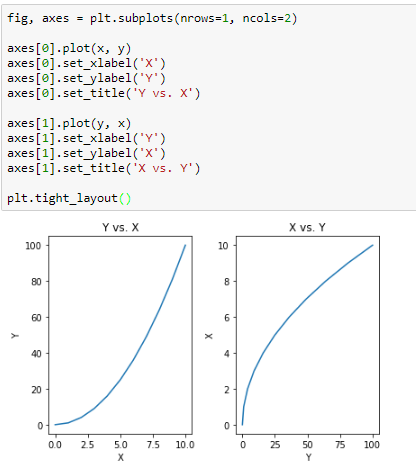
We can also add further customization(x-label, y-label, title) to each of the subplots just like we did in the previous post:


The tight_layout() method is used to avoid any overlap of values between the subplots.

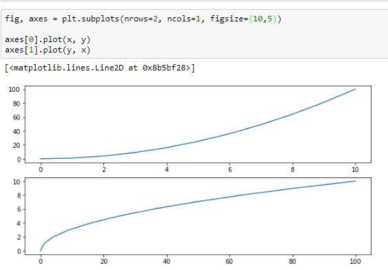
We can also change the size of the plots using figsize parameter. Here is an example:


Saving a Matplotlib plot

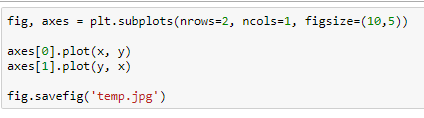
We can save a Matplotlib plot using the savefig() method passing the file name with the extension into a variety high quality formats such as png, jpeg, eps, pdf and many more.


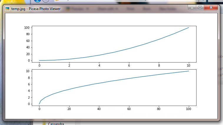
And here is my jpeg file image:


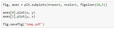
You can also save the image as a pdf by passing the .pdf as extension:


We can also add legend to the figure using the legend() method in order to distinguish the plots. Here is the step to add the legend:


Remember to set the label parameter with each of the plots separately in order for the legend to work correctly.

We will end this post here on Matplotlib. In the next post, we will see various customization that can be done with the plots such as changing the line color, line width, line style and so on. 
Share:

Thursday, 17 August 2017

Data Science & Machine Learning - 6.2 Matplotlib Basic Plots

Hi friends,

Welcome to another post on Matplotlib under Data Science & Machine Learning. In the previous post, we discussed the installation process of Matplotlib. In this we will see the basic plots supported by Matplotlib.

Note: All the commands discussed below are run in the Jupyter Notebook environment. See this post on Jupyter Notebook to know about it in detail. 

Matplotlib Basic Plots

Before we can begin to use the Matplotlib library, we need to import it using the following command:


Although this will import the Matplotlib library in Python yet we need to run the following additional command in order for the plots to be displayed inside the Jupyter Notebook:

%matplotlib inline


This requests the Jupyter Notebook to display the plots inline i.e. within the Jupyter Notebook.

First, I have generated a NumPy Array of random numbers using the linspace method which will be used to draw the plots. 


Let's now draw some plots using the Matplotlib library. 


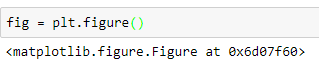
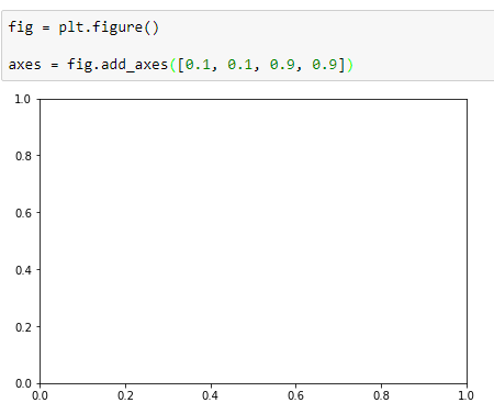
In the above figure, we have created a figure object (fig) using figure() method which renders a FigureCanvas (an empty background) to draw plots on using the Matplotlib library. Next, we add axes to the fig object created above using the add_axes() method:


The add_axes() method takes a list (with four elements) as a parameter signifying the left point, the bottom point, the width and the height respectively of the axes. You can pass in any values within the range [0, 1] for each of the parameters.

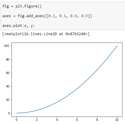
Next, we plot the above generated NumPy arrays on our axes using the plot() method:


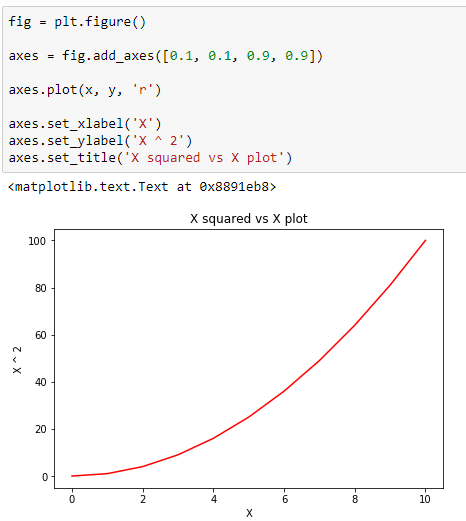
Now, we can do several customization to our plot such as adding x and y labels, adding the plot title or changing the plot color:


We can also add multiple axes to the same plot. Here is an example of two axes within a figure object:


We can do similar customization as before by calling the required method on the appropriate axis object as shown below:


I have only discussed the object-oriented way of using Matplotlib here. You can also use the Matplotlib using the functional method by going through this official documentation. I however like the object-oriented way better since it provides flexibility and controlled way of usage. In the next post, we will discuss how to draw subplots inside the figure canvas and other advance features of Matplotlib library. 
Share:

Thursday, 3 August 2017

Data Science & Machine Learning - 6.1 Matplotlib & Its Installation

Hi friends,


Welcome to this post on Data Visualization under Data Science & Machine Learning. In the previous post, we performed some practical data analysis using Pandas on the Kaggle SF Salaries Dataset. In this post, we'll learn about Matplotlib, one of the most popular Python libraries for visualizing our results using various plots. 

About Matplotlib [1]

  1. Matplotlib is a Python 2D plotting library which produces high quality figures in a variety of hardcopy formats and interactive environments across platforms
  2. It allows us to generate plots directly from NumPy Arrays and Pandas DataFrames which makes it even more popular
  3. It can be used in Python scripts, the Python and IPython shell, the jupyter notebook, web application servers, etc.
  4. It is widely said that Matplotlib tries to make easy things easy and hard things possible
Here are some of the plots supported by the Matplotlib library:


screenshotsscreenshotsscreenshotsscreenshots
Image source: Matlplotlib

Matplotlib Installation

Just like the installation of other Python libraries such as NumPy/Pandas, it is recommended to use the Anaconda distribution of Python in order to install Matlplotlib as well. You can see the installation of Anaconda distribution of Python here. Once you have that installed, you can install Matplotlib by running the following command in the command prompt:

conda install matplotlib

You can still install Matplotlib even if you don't have the recommended Anaconda distribution of Python (not recommended) using the following command:

pip install matplotlib

You can see the list of various plots supported by Matplotlib from this link. Now that we have installed Matplotlib successfully on our systems, we will start using the Matplotlib library starting with basic plots from the next post.
Share:

Thursday, 20 July 2017

Data Science & Machine Learning Cheat Sheet

Data Science & Machine Learning Cheat Sheet


1. NumPy


2. Pandas


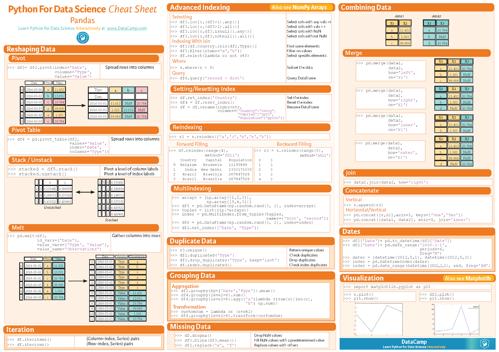
Source — https://www.datacamp.com/community/blog/python-pandas-cheat-sheet/#gs.KQOXkLU


Source — https://www.datacamp.com/community/blog/pandas-cheat-sheet-python#gs.lfJBxWo

3. Scipy


4. Matplotlib


5. Scikit-learn


 6. Neural Networks Zoo

7. PySpark


8. R Studio (dplyr and tidyr)


9.     Keras


Share:

Contact Me

Name

Email *

Message *

Popular Posts