
Hi friends,
Note: All the commands discussed below are run in the Jupyter Notebook environment. See this post on Jupyter Notebook to know about it in detail.


Welcome to another post on Python's Matplotlib library under Data Science & Machine Learning. In the previous post, we discussed basic ways to draw plots using Matplotlib. In this post, we'll see how to draw subplots using the Matplotlib library.
Note: All the commands discussed below are run in the Jupyter Notebook environment. See this post on Jupyter Notebook to know about it in detail.
Matplotlib subplots
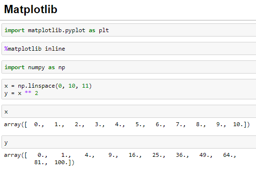
Let's first import the Matplotlib library and also recreate the NumPy Array we created in the previous post as the data for the plots. I suggest you to go through the previous post if you find any difficulties in any of the statements executed below:
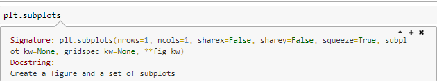
Let's now start with the Matplotlib subplots. To create the Matplotlib subplots, the Matplotlib library provides the subplots() method:
In the above figure, we can see that the subplots() method creates a figure and a set of subplots and the number of subplots are specified by the nrows and the ncols parameters (by default, their values are 1). Let's now create a subplot of one row and two columns using the subplots() method:
The plt.subplots() method itself adds the axes to the figure based on the nrows and the ncols values which were earlier required to be added manually by us in case of single plots in the previous post.
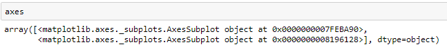
Further note that the axes variable in the above figure is an array of axes which is verified below:
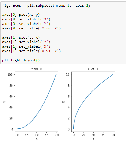
Now, we can draw some plots using the NumPy Arrays we created above for each of the axes using the array indexing notation:
We can also add further customization(x-label, y-label, title) to each of the subplots just like we did in the previous post:
The tight_layout() method is used to avoid any overlap of values between the subplots.
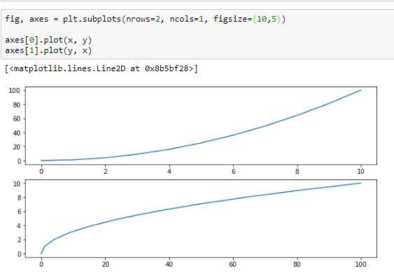
We can also change the size of the plots using figsize parameter. Here is an example:
Saving a Matplotlib plot
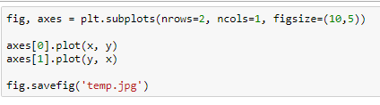
We can save a Matplotlib plot using the savefig() method passing the file name with the extension into a variety high quality formats such as png, jpeg, eps, pdf and many more.
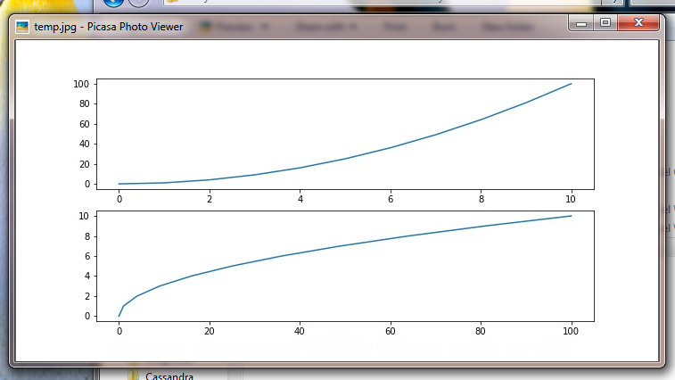
And here is my jpeg file image:
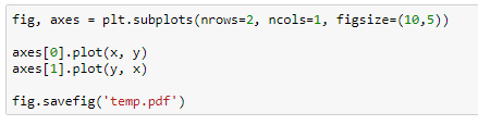
You can also save the image as a pdf by passing the .pdf as extension:
We can also add legend to the figure using the legend() method in order to distinguish the plots. Here is the step to add the legend:
Remember to set the label parameter with each of the plots separately in order for the legend to work correctly.
We will end this post here on Matplotlib. In the next post, we will see various customization that can be done with the plots such as changing the line color, line width, line style and so on.
We will end this post here on Matplotlib. In the next post, we will see various customization that can be done with the plots such as changing the line color, line width, line style and so on.

This video helps me to understand Matplotlib whats your opinion guys.
ReplyDeleteImage Processing Projects For Final Year
DeleteData Mining Projects For Final Year
Machine Learning Projects for Final Year
Thanks for Sharing Information to us. If Someone wants to know about QA and software testing this is the Right place for you...
ReplyDeleteSoftware Testing Services
Software Testing Services in India
Software Testing Companies in India
Software Testing Services in USA
Software Testing Companies in USA
Software Testing Companies
Software Testing Services Company
Software Testing Companies in New York