Saturday, 22 August 2020

Data Science & Machine Learning - 7.2 Seaborn Distribution Plots

Hi friends,

Welcome to this post on visualizing Distribution Plots under Data Science & Machine Learning. In the previous post, we discussed about the installation process of Seaborn library for Data Visualization. In this post, we'll learn about distribution plots supported by Seaborn that allows us to visualize the distribution of a dataset.

Note: All the commands discussed below are run in the Jupyter Notebook environment. See this post on Jupyter Notebook to know about it in detail. 

Seaborn Distribution Plots

So, let's first import the useful libraries. 


I have imported NumPy library as well to generate random data to fill our plots with. Now, let's start with creating various plots using Seaborn.
  1. distplot : It is used to visualize the distribution of a univariate (one variable) data points. In the example below, first we generated a random NumPy array and then plot a distribution plot of the same using the Seaborn's distplot() method:


    What it returns is basically a histogram of data points and the dark blue line is called the KDE (Kernel Density Estimation). We can remove the KDE from our plot by setting the kde parameter to false.

    The y-axis represents the count of the data points in the range represented by x-axis. We can also change the bins parameter to get a detailed/abstract view of the data points. Generally, larger the bins value more detailed the distribution plot and smaller the bins value less detailed the distribution plot.
Share:

Sunday, 16 August 2020

Data Science & Machine Learning - 7.1 Seaborn & Its Installation

Hi friends,

Welcome to this post on Data Visualization under Data Science & Machine Learning. In the previous few posts, we discussed about the Matplotlib plotting library in Python for Data Visualization. In the next few posts, we'll learn about Seaborn, another powerful Python visualization library built on top of Matplotlib.

About Seaborn [1]

Seaborn is a powerful Python Data Visualization library for making informative statistical graphics in Python. It is built on top of Matplotlib and include support for NumPy and Pandas data structures and statistical routines from Scipy and Statsmodels.

Some of the features that Seaborn offers are

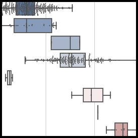
Here are some of the plots supported by the Seaborn library:

screenshots       screenshots

screenshots       screenshots

Image source: Seaborn

Seaborn Installation

Just like the installation of other Python Data Science libraries such as NumPy/Pandas/Matplotlib, it is recommended to use the Anaconda distribution of Python in order to install Seaborn as well. You can see the installation of Anaconda distribution of Python here. Once you have that installed, you can install Seaborn by running the following command in the command prompt:

conda install seaborn

You can still install Seaborn even if you don't have the recommended Anaconda distribution of Python (not recommended) using the following command:

pip install seaborn

You can see the list of various plots supported by Seaborn from this link. Now that we have installed Seaborn successfully on our systems, we will start using the Seaborn library starting with various plots for visualizing the distribution of a dataset from the next post.
Share:

Sunday, 15 October 2017

Programming Resources

I will keep editing the resources for other programming languages as well. 
Share:

Monday, 11 September 2017

Data Science & Machine Learning - 6.4 Matplotlib Plots Customization

Hi friends,

Welcome to this post on Matplotlib Plots Customization under Data Science & Machine Learning. In the previous post, we discussed how to draw subplots using Matplotlib. In this post, we will learn to customize (plot color, plot style, etc.) our plots.

Note: All the commands discussed below are run in the Jupyter Notebook environment. See this post on Jupyter Notebook to know about it in detail.

Matplotlib Plots Customization

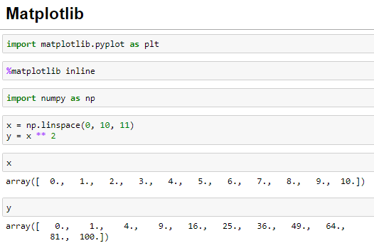
Let's first import the Matplotlib library and also recreate the NumPy Array we created in the previous post as the data for the plots. I suggest you to go through this post if you find any difficulties in any of the statements executed below:


Let's now create some plots with the Matplotlib:


Change the plot color

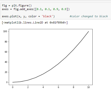
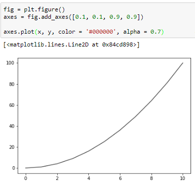
Matplotlib supports two ways (using the color name and the RGB hex code) of changing the color of the plot using the color parameter of the plot method. I have changed the plot color to black using these two ways in the below example:


Change the line opacity

We can also change the opacity of the line of the plot using the alpha parameter of the plot method. The higher the alpha value the more opaque the plot. I have set the opacity to 0.8 in the below example:

Change the line width

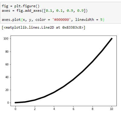
We can change the width of the line of the plot using the linewidth parameter of the plot method. I have changed the linewidth to five times the default line width in the below example:


Change the line style

Matplotlib also supports various line styles for the plots. These can be changed by the linestyle parameter of the plot method. Below is an example of the dashed line style supported by the plot method:


Here is a list of all the style types supported by the plot method:

['solid' | 'dashed' | 'dashdot' | 'dotted' | (offset, on-off-dash-seq) |  '-' | '--' | '-.' | ':' | 'None' | ' ' | '']


Marker for the actual points

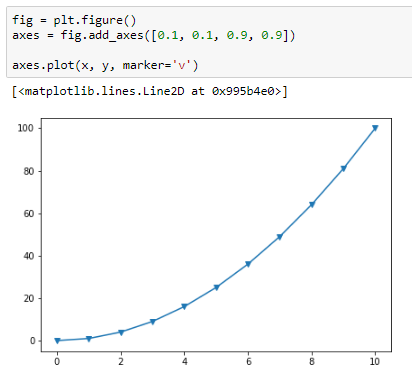
Matplotlib also supports marking actual points on the graph using the marker parameter of the plot() method. Here is an example of triangle down marker:


The following link lists all the marker types supported by the plot method. I also recommend visiting this awesome link which provides tons of other customization options we can do with Matplotlib. With this, we end this post on Matplotlib. From the next post onward, we'll learn about Seaborn, another very important Data Science library to plot beautiful statistical plots.
Share:

Contact Me

Name

Email *

Message *

Popular Posts